StyleGuide makes it easy for iOS & other Apple platform developers to quickly preview HIG typography, colours and sizes. As featured on iOS Dev Tools. StyleGuide is available to download on iOS, iPadOS and macOS.
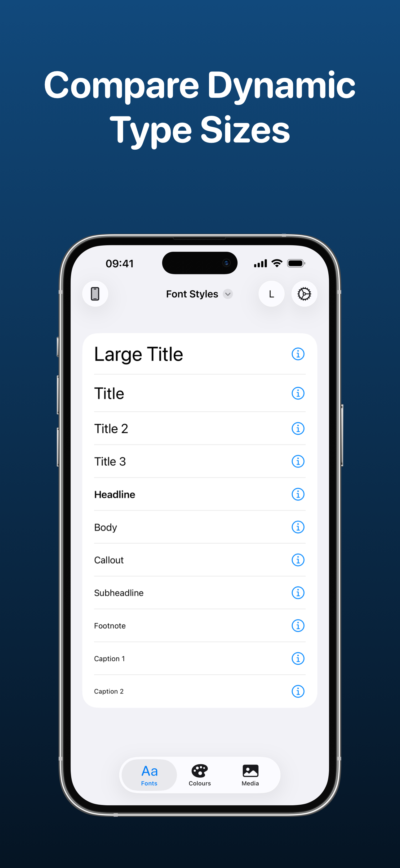
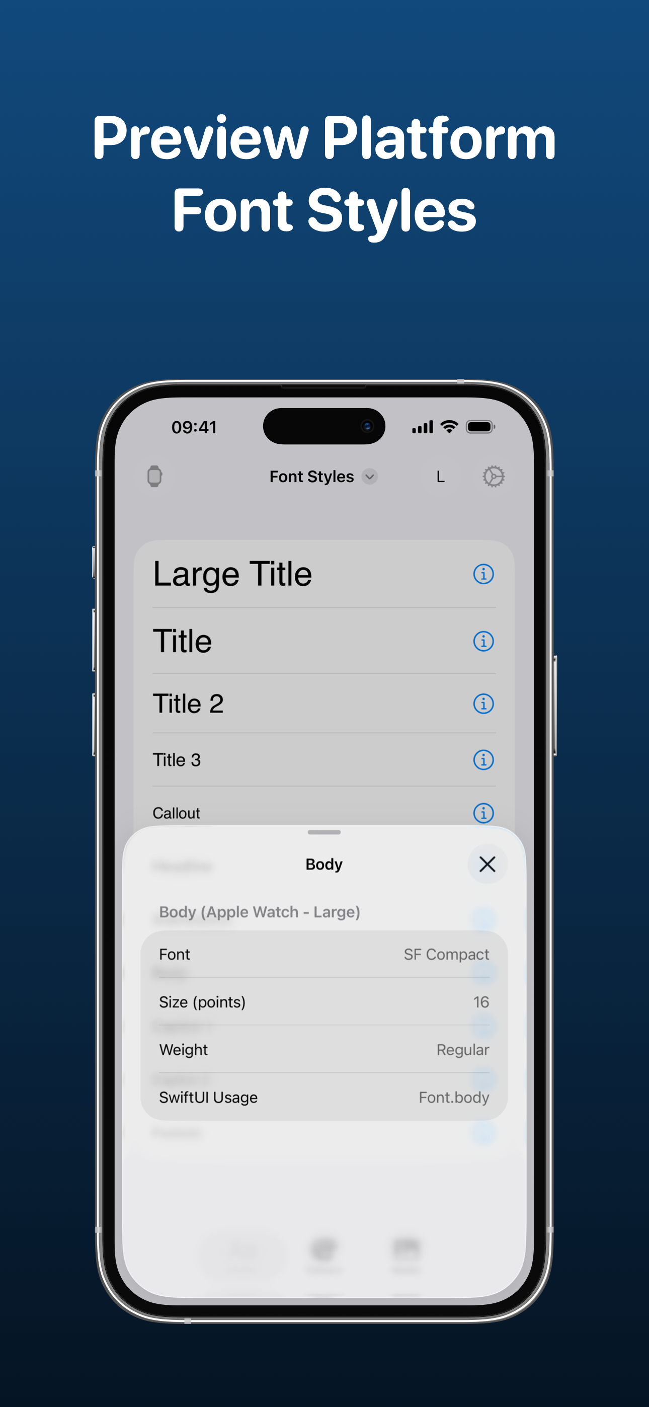
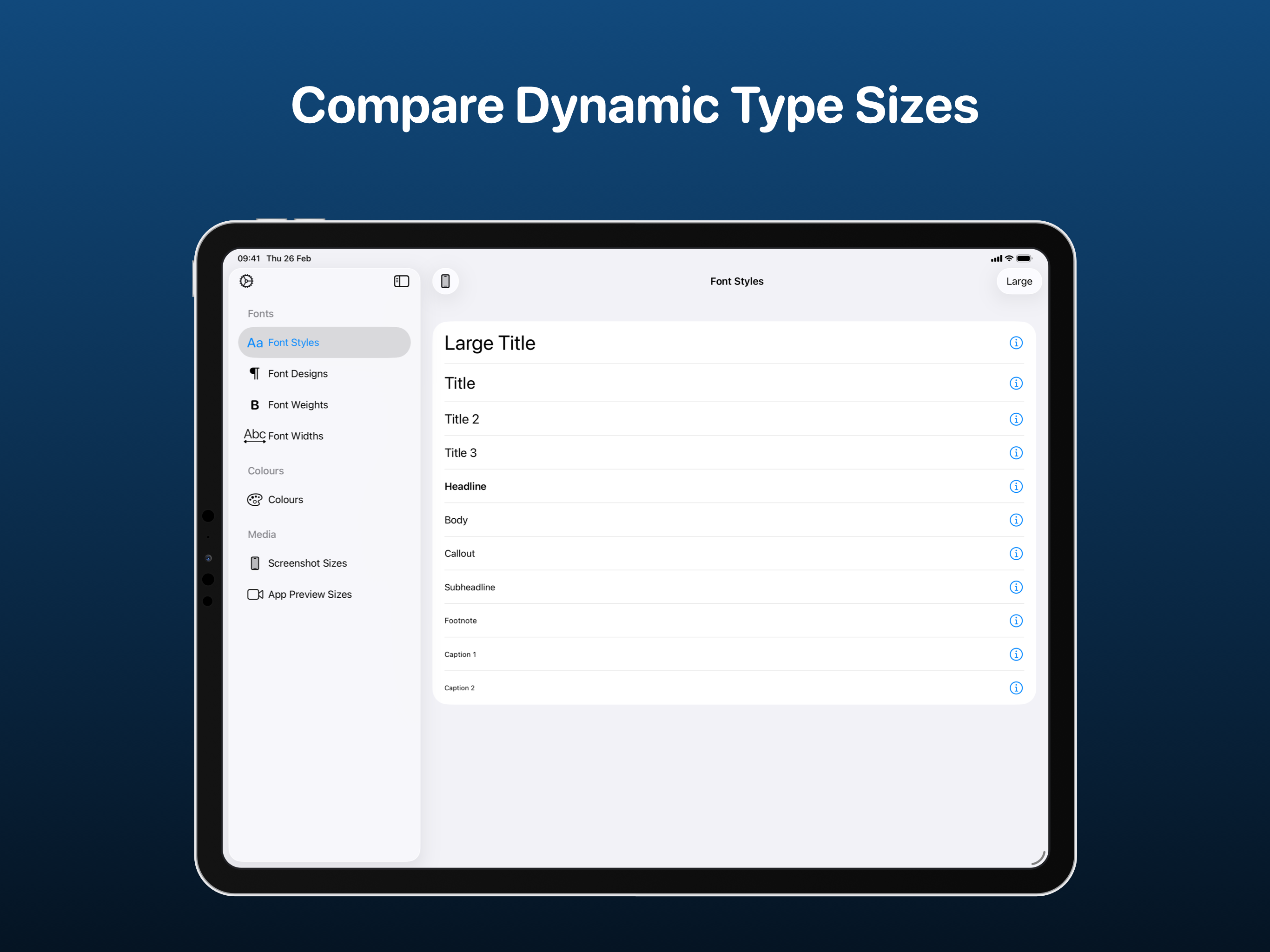
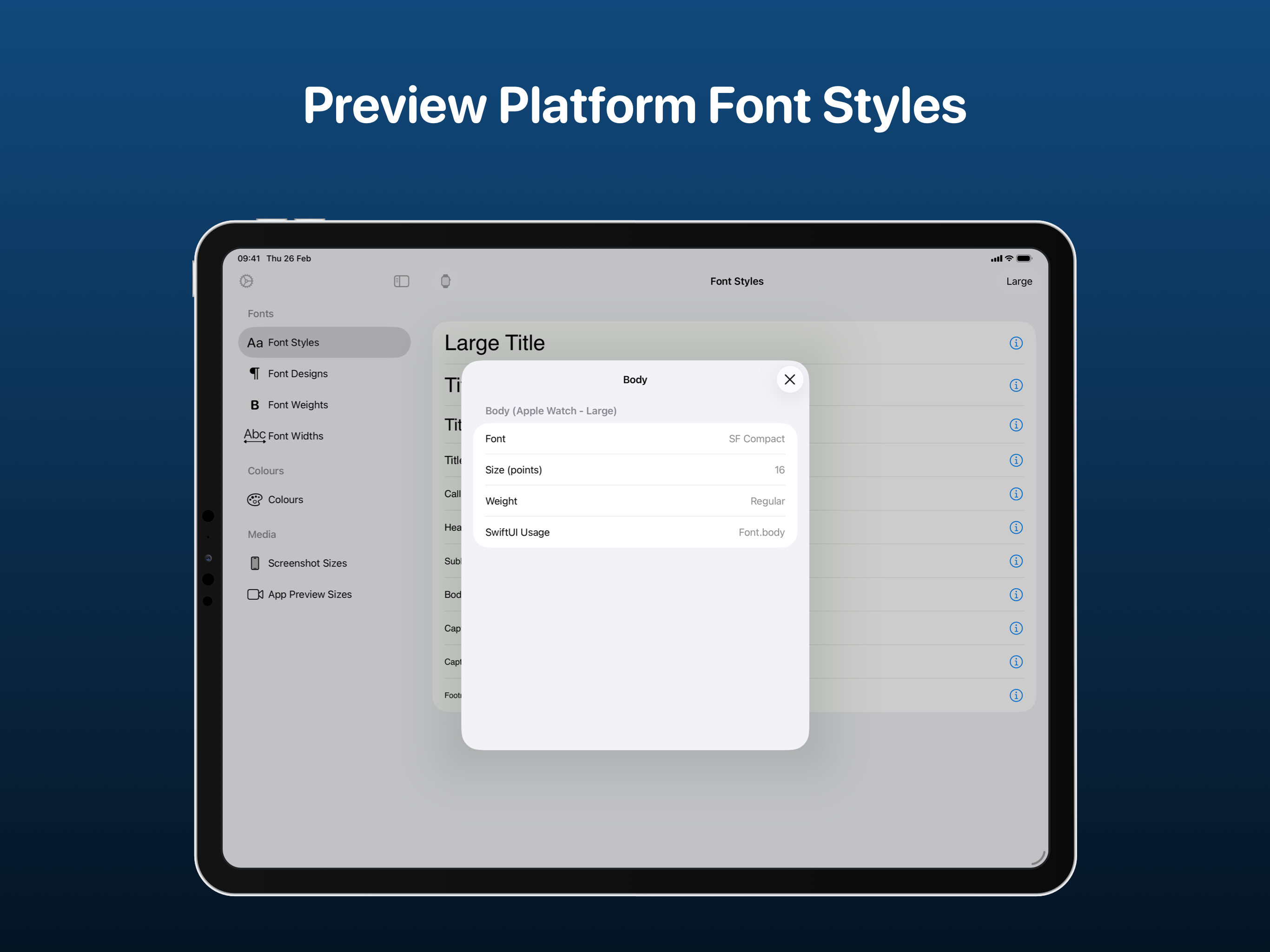
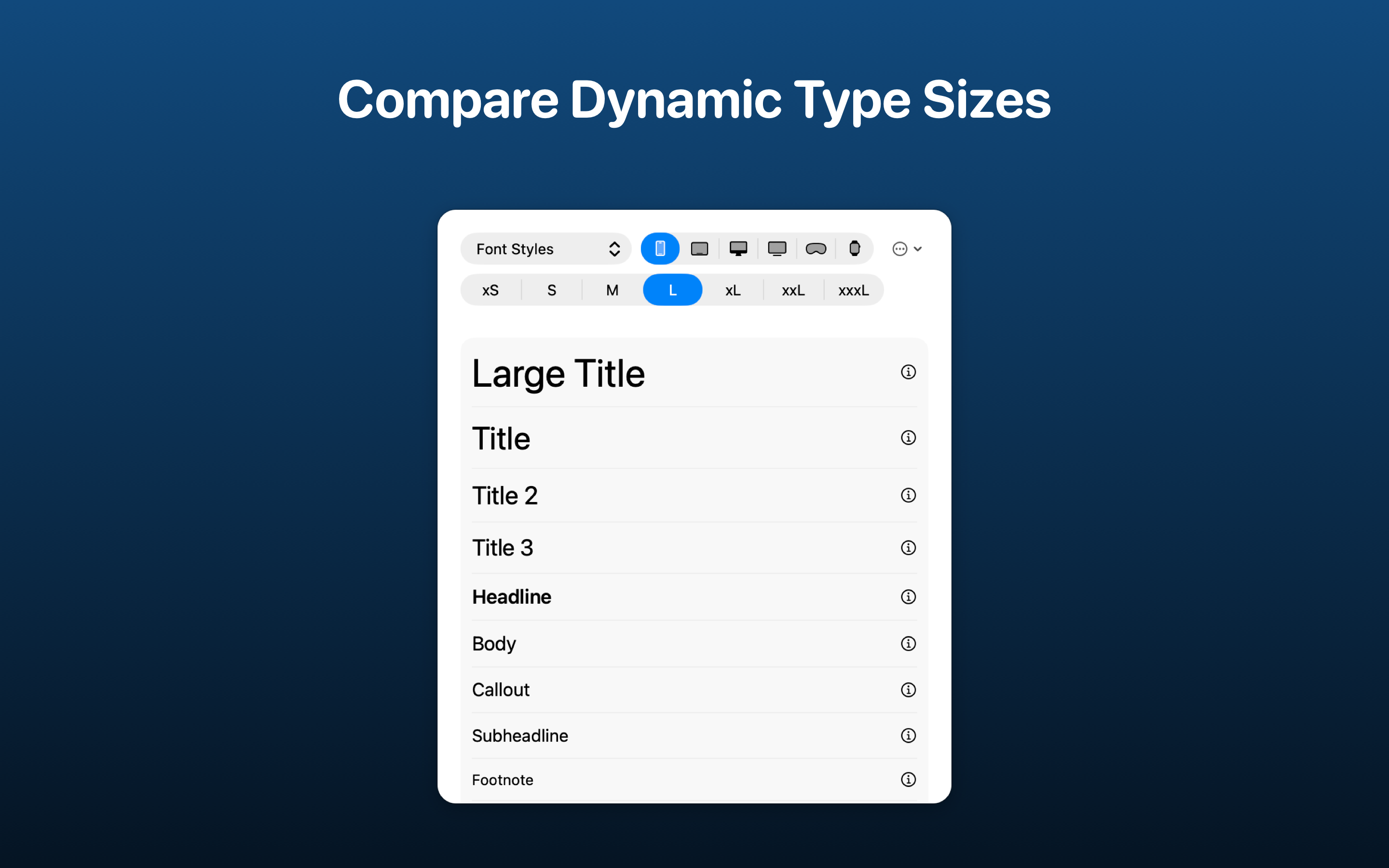
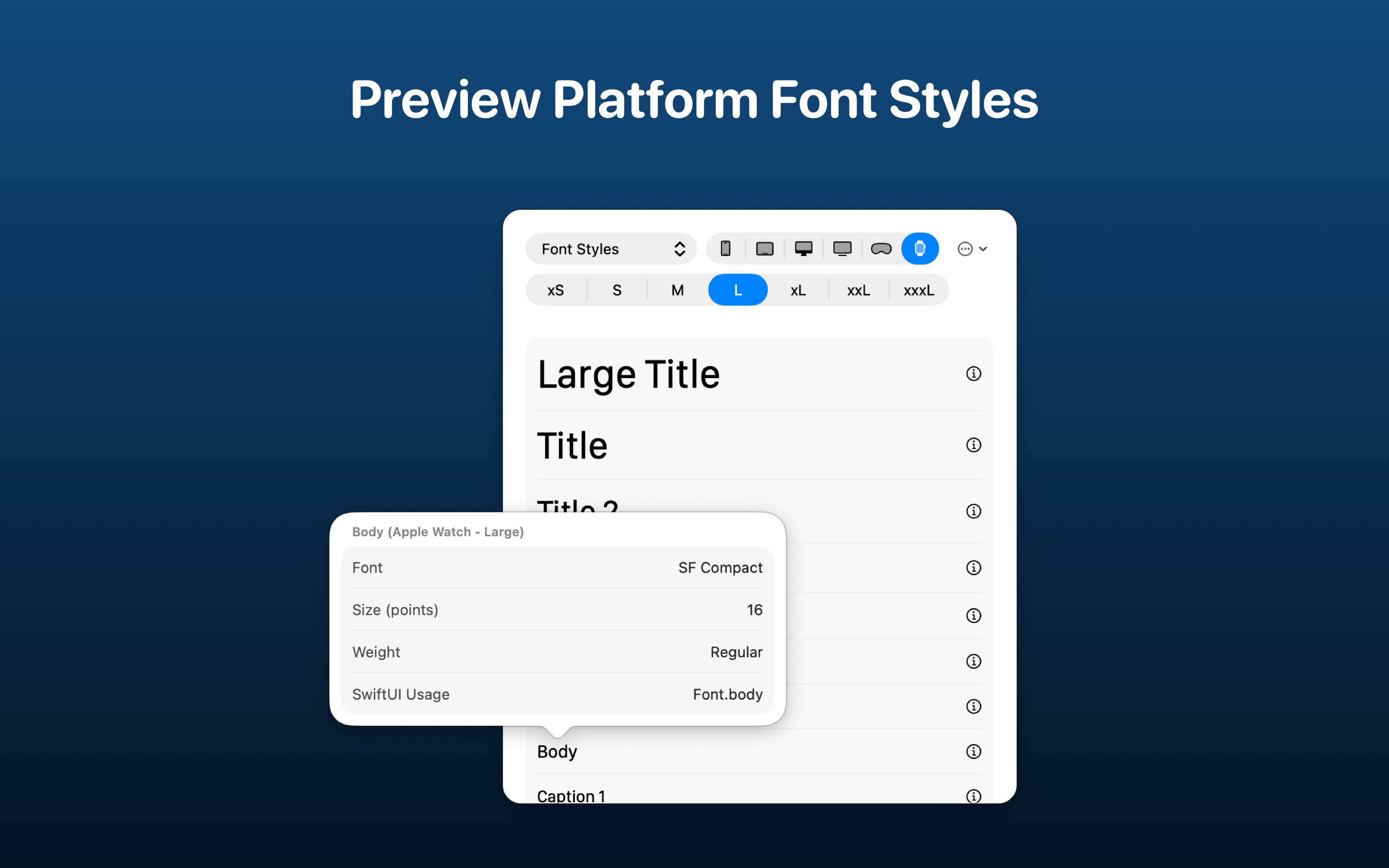
Quickly preview all of the different font styles (e.g. Large Title, Headline etc.) at multiple Dynamic Type sizes so you can choose the correct font style in your app. There's support for previewing styles on iOS, iPadOS, macOS, tvOS, watchOS and visionOS. Select a font style to view more details such as font, weight, size and how to use it in SwiftUI.
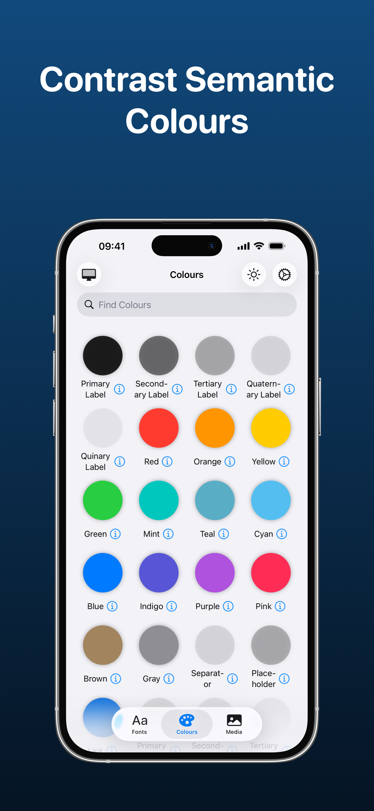
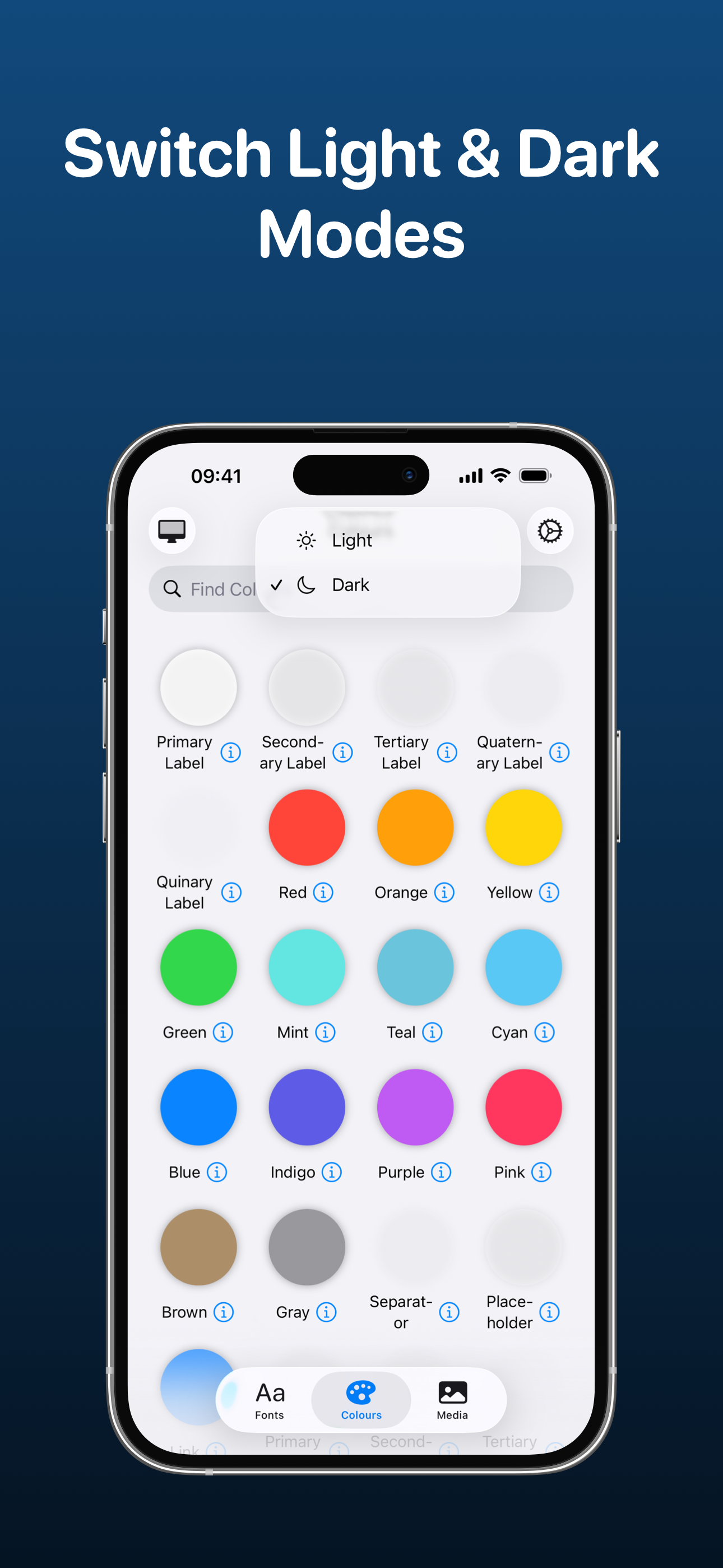
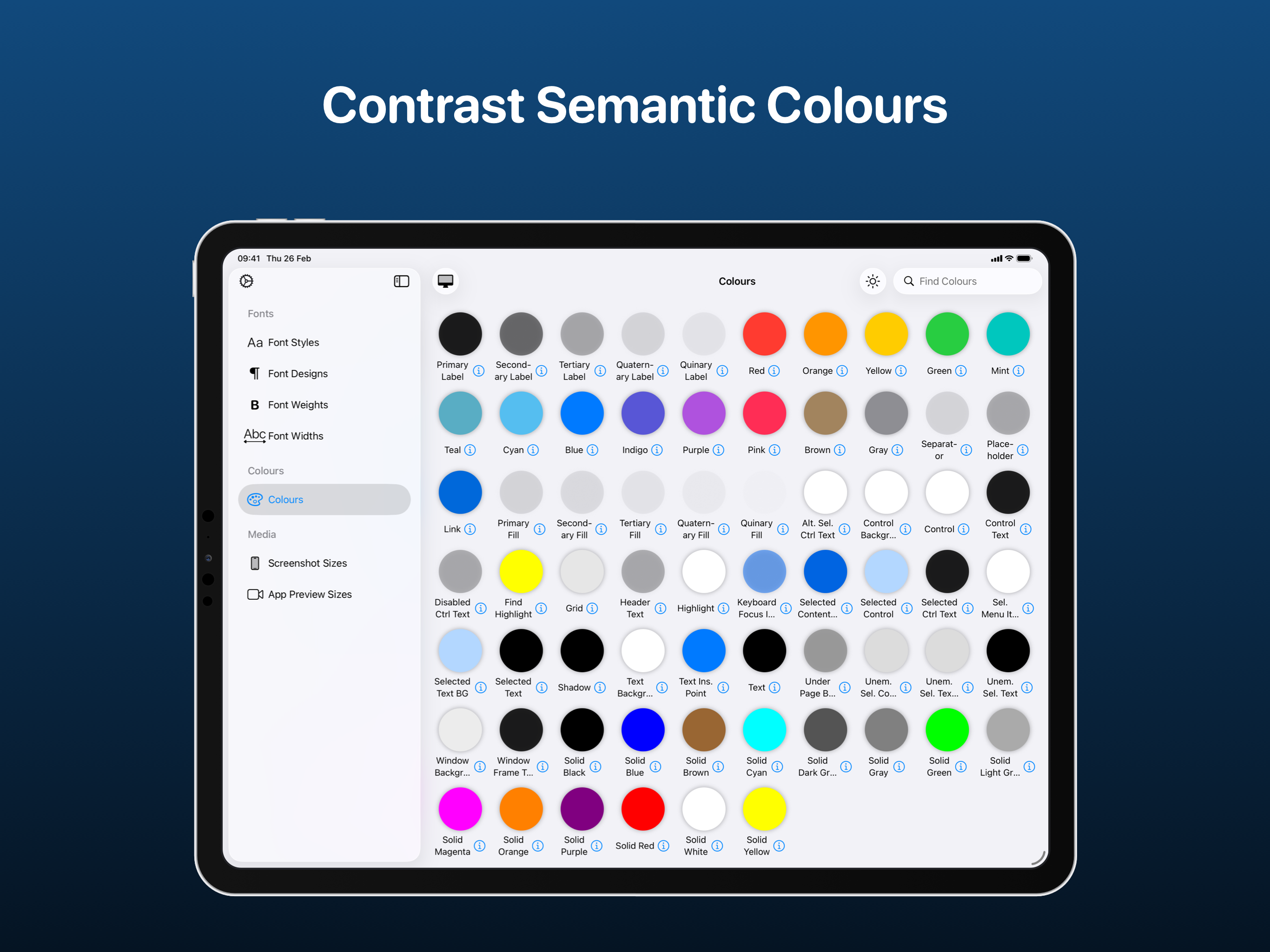
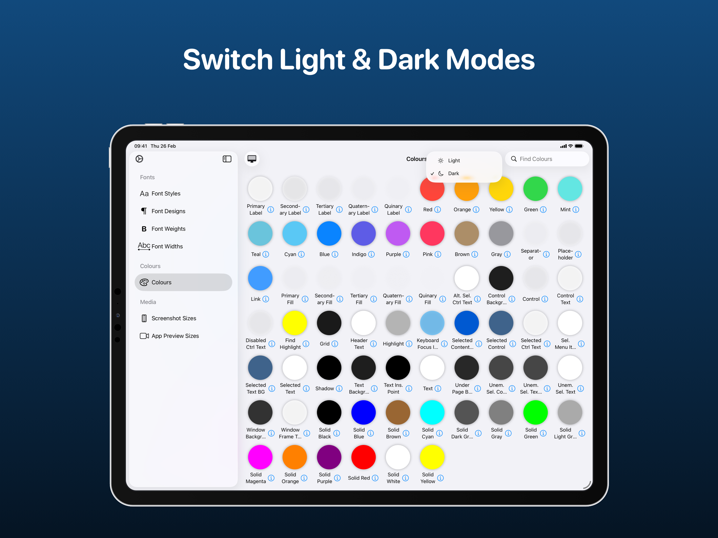
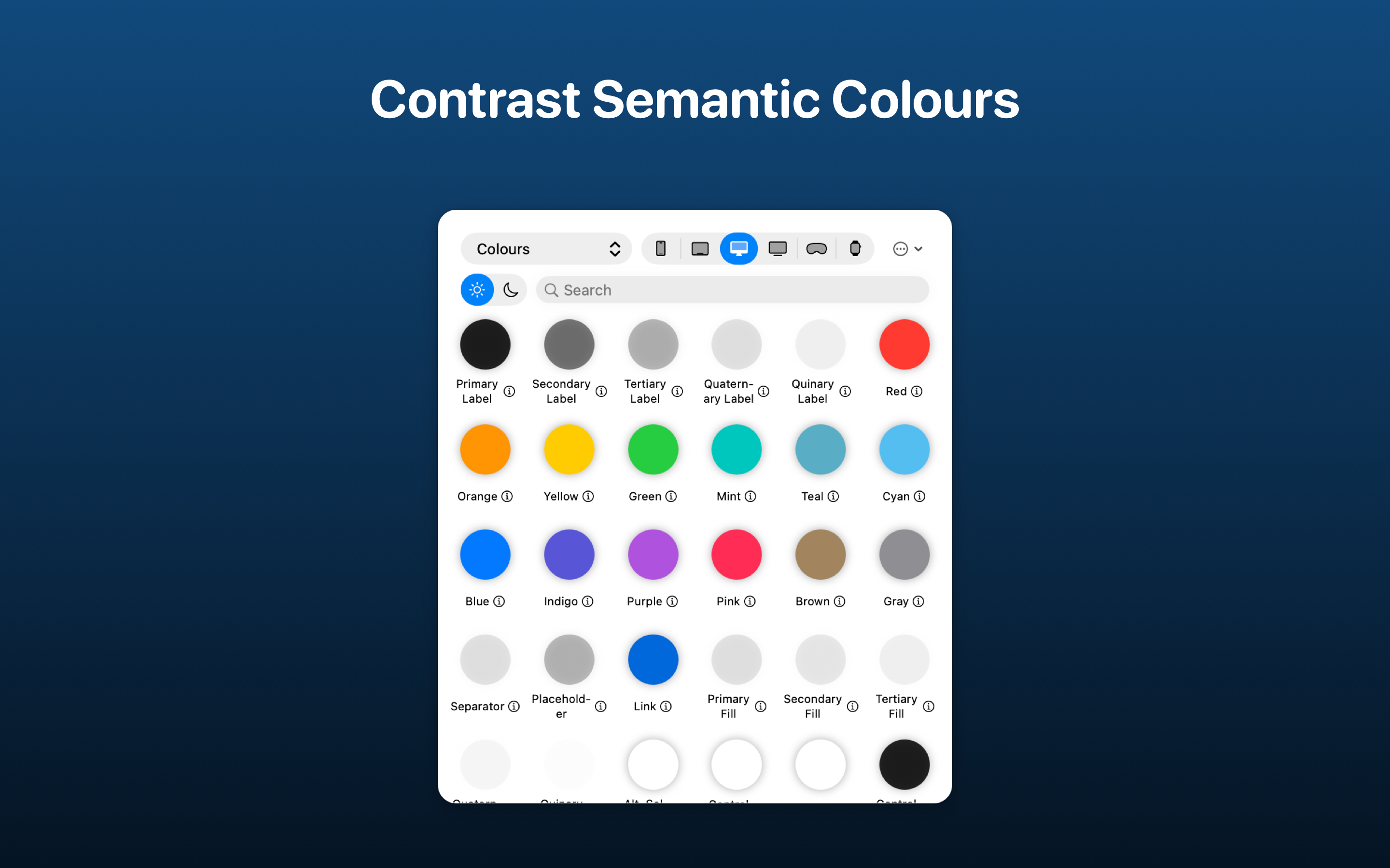
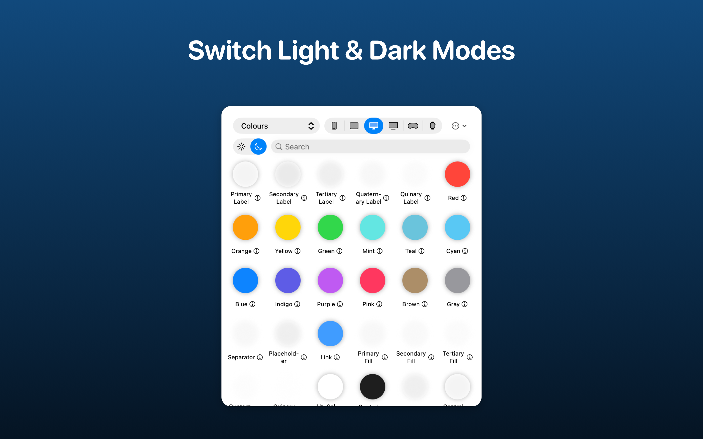
View a selection of all the available colours for each Apple platform. Semantic colours that support both light & dark modes can be previewed using the toggle and selecting a colour will provide more details such as RGBA values and how to use it in SwiftUI. Both SwiftUI and UIKit/AppKit colours are included so you'll be able to preview them all.
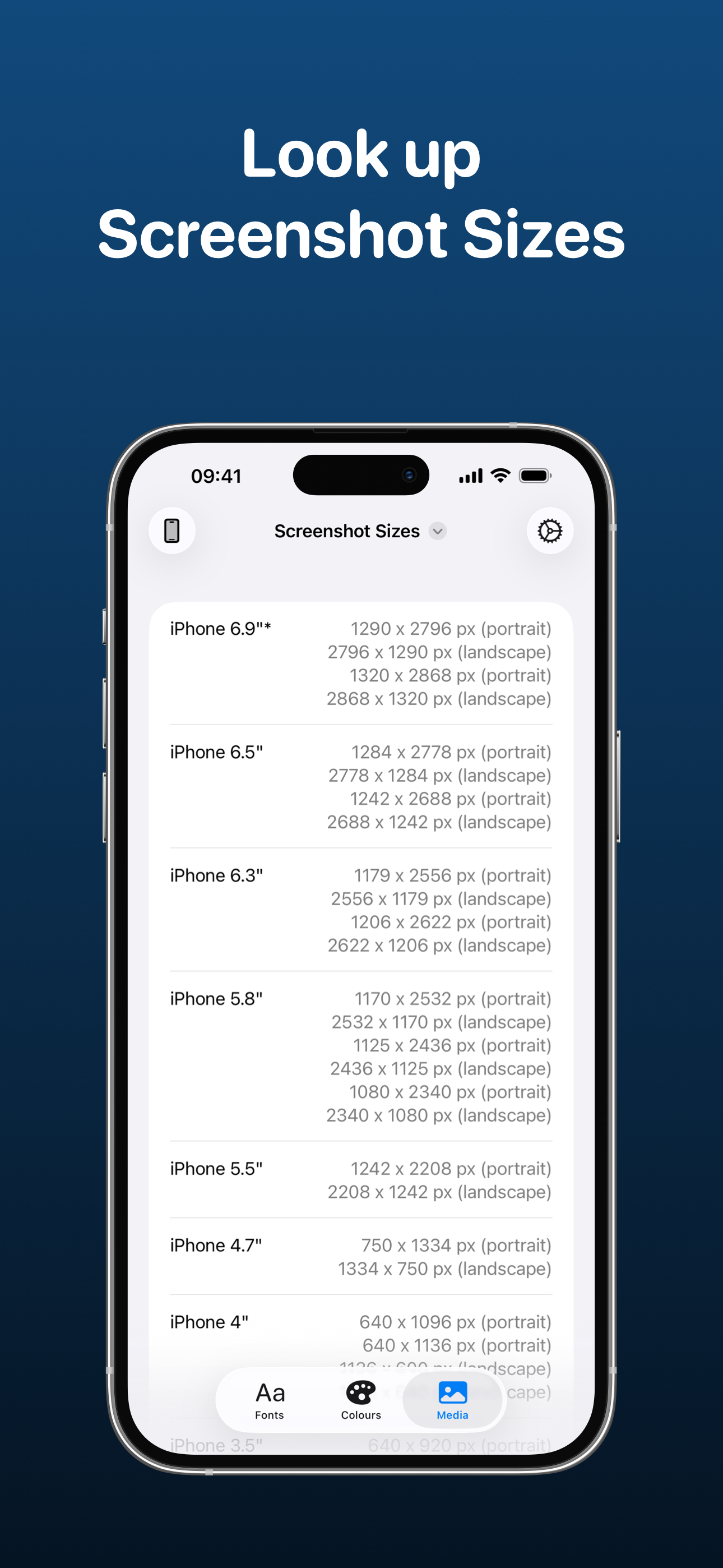
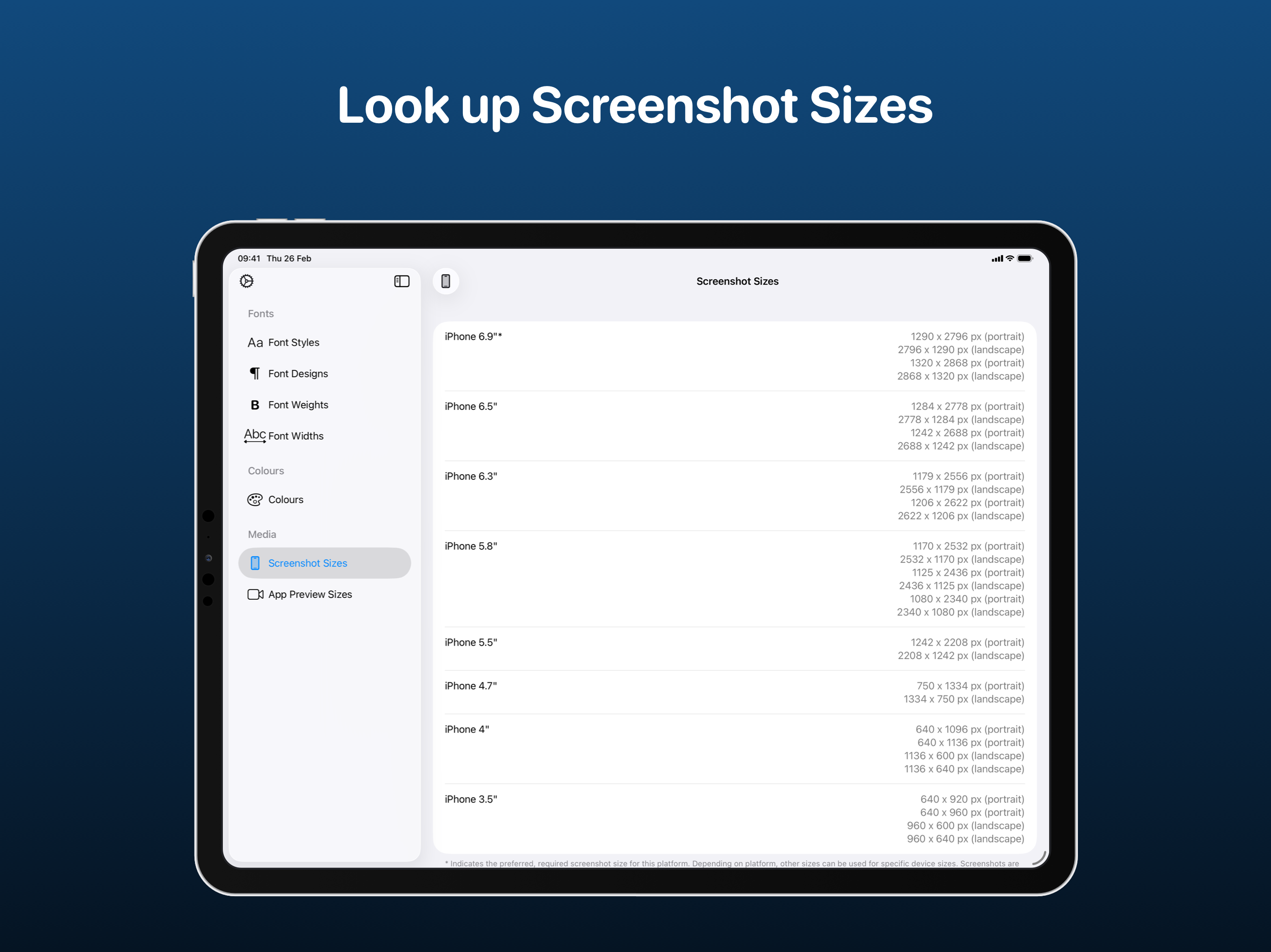
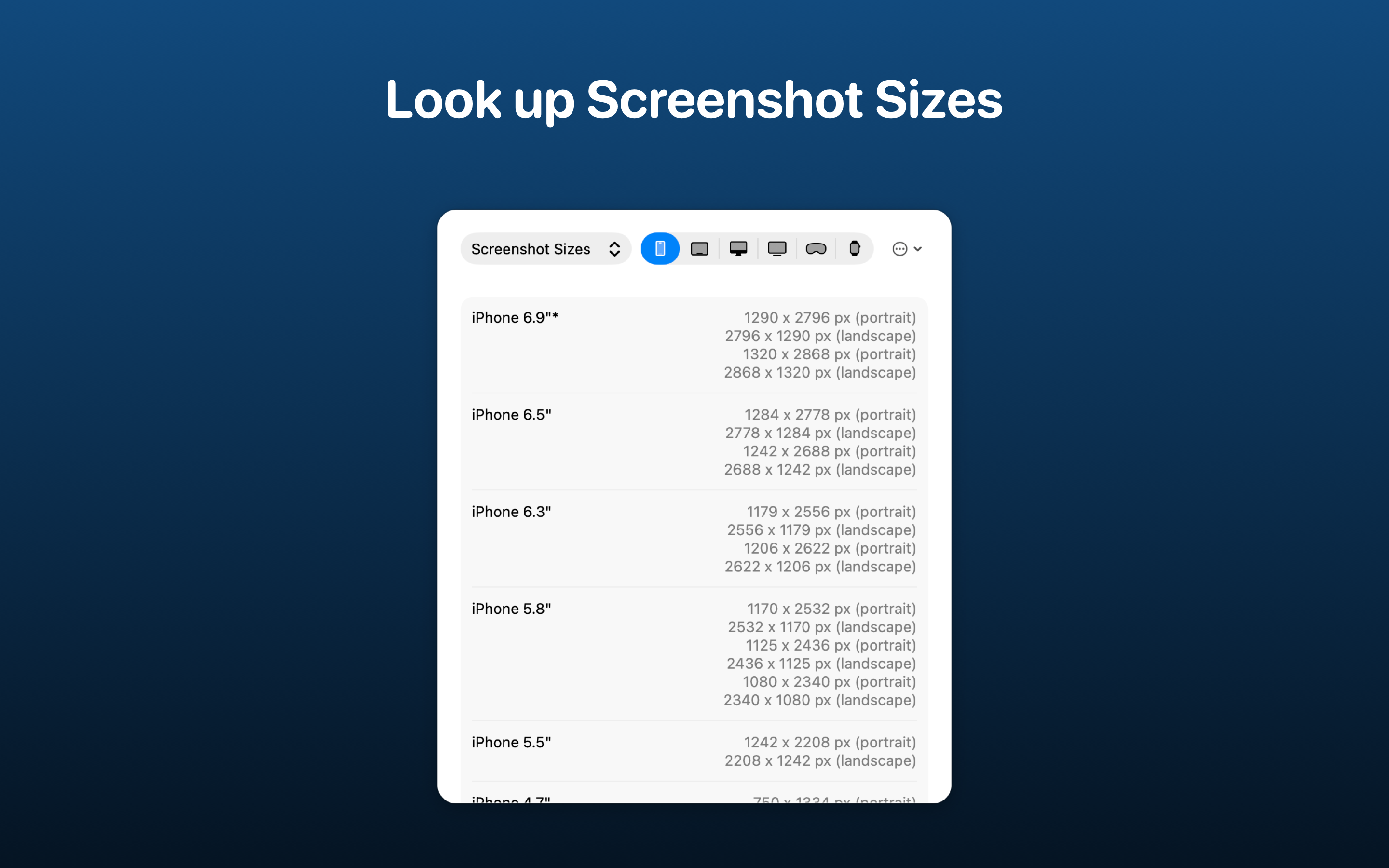
Before creating your App Store screenshots, get an idea of what sizes you'll need to use to have them accepted. There's support for all Apple platforms.
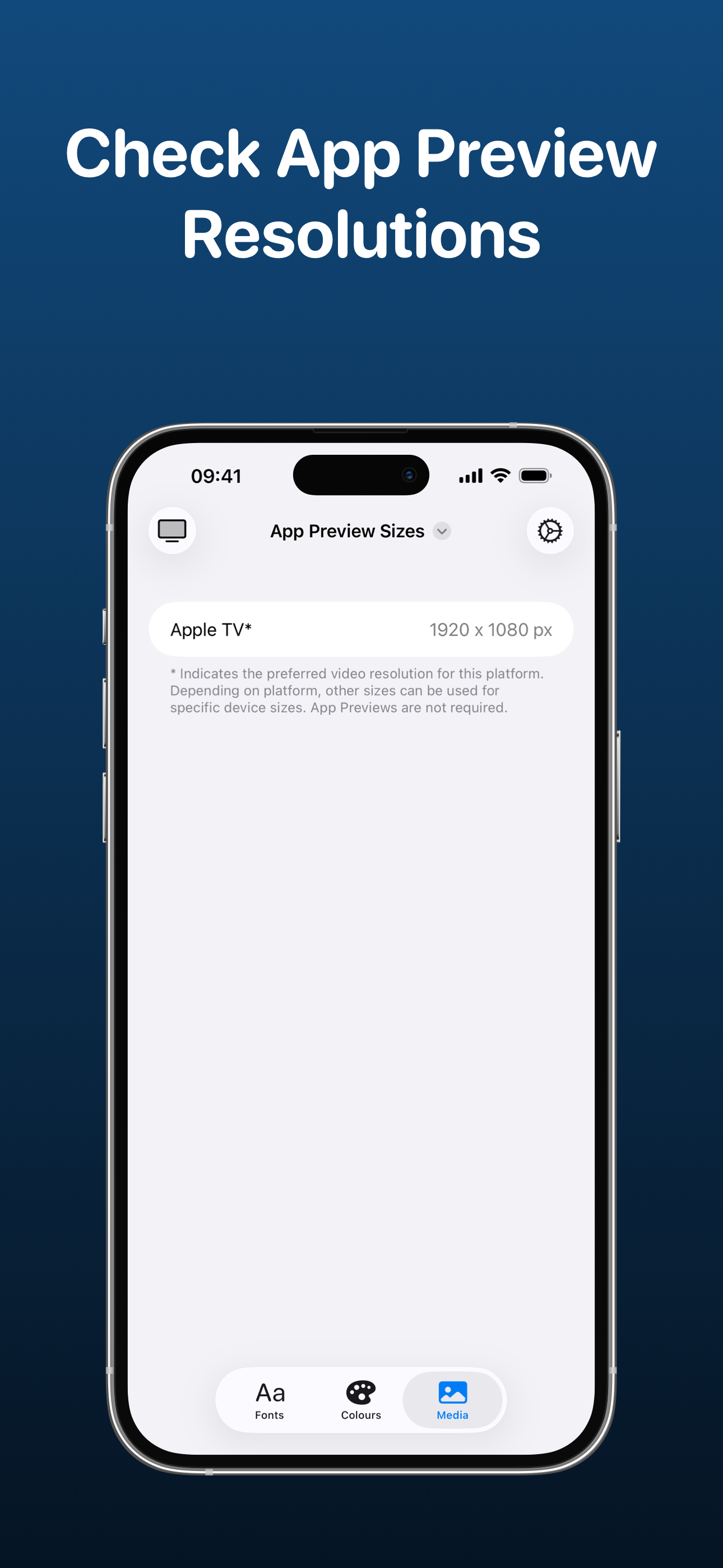
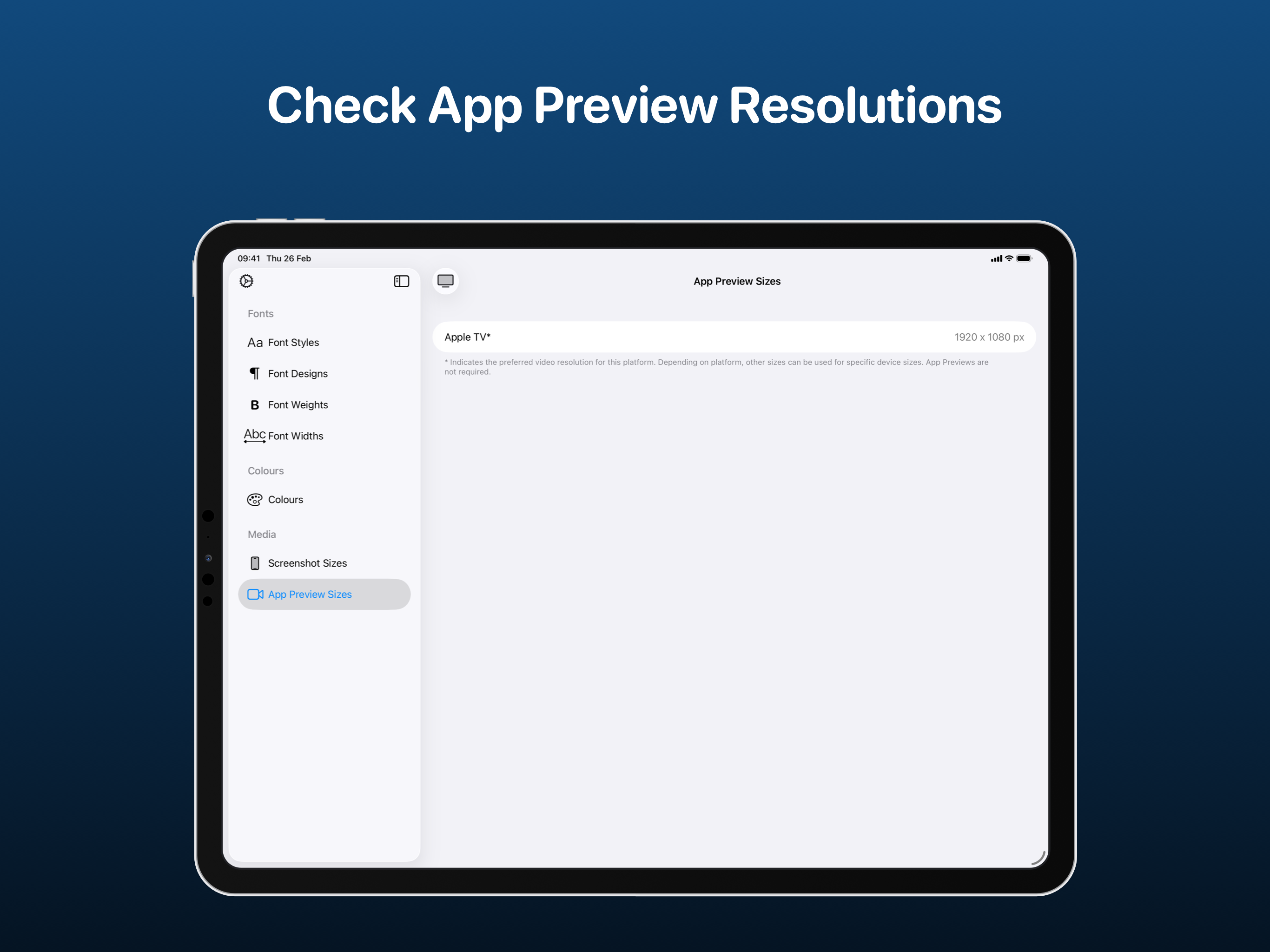
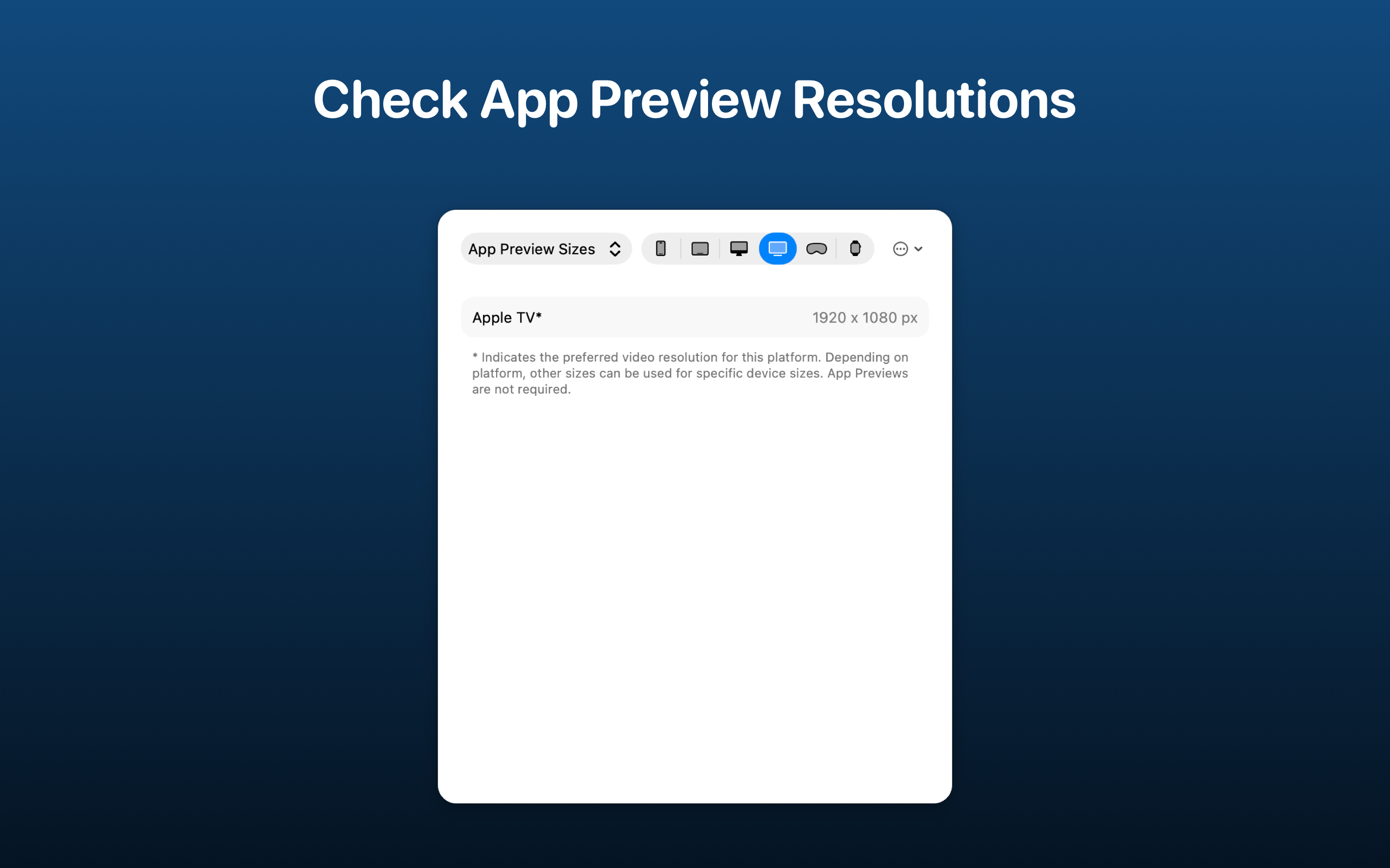
Use the App Preview Sizes tool to view the required resolutions for uploading videos to App Store Connect. There's support for all applicable Apple platforms.
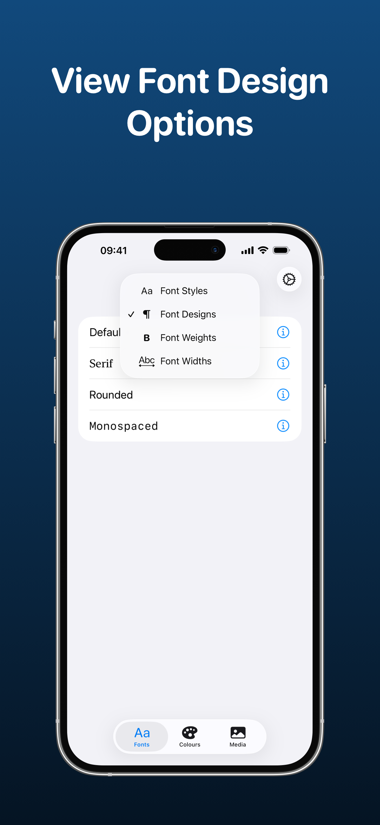
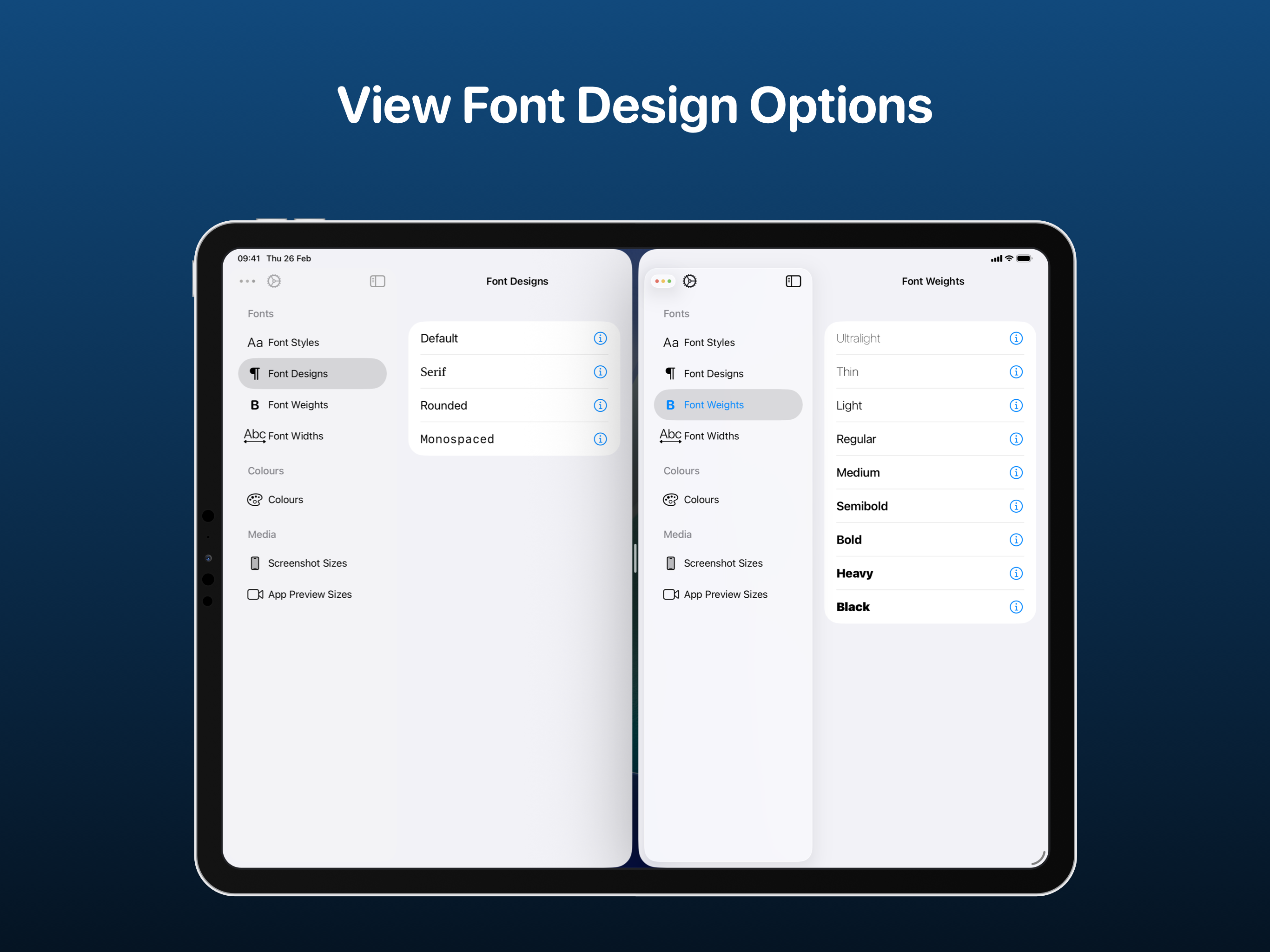
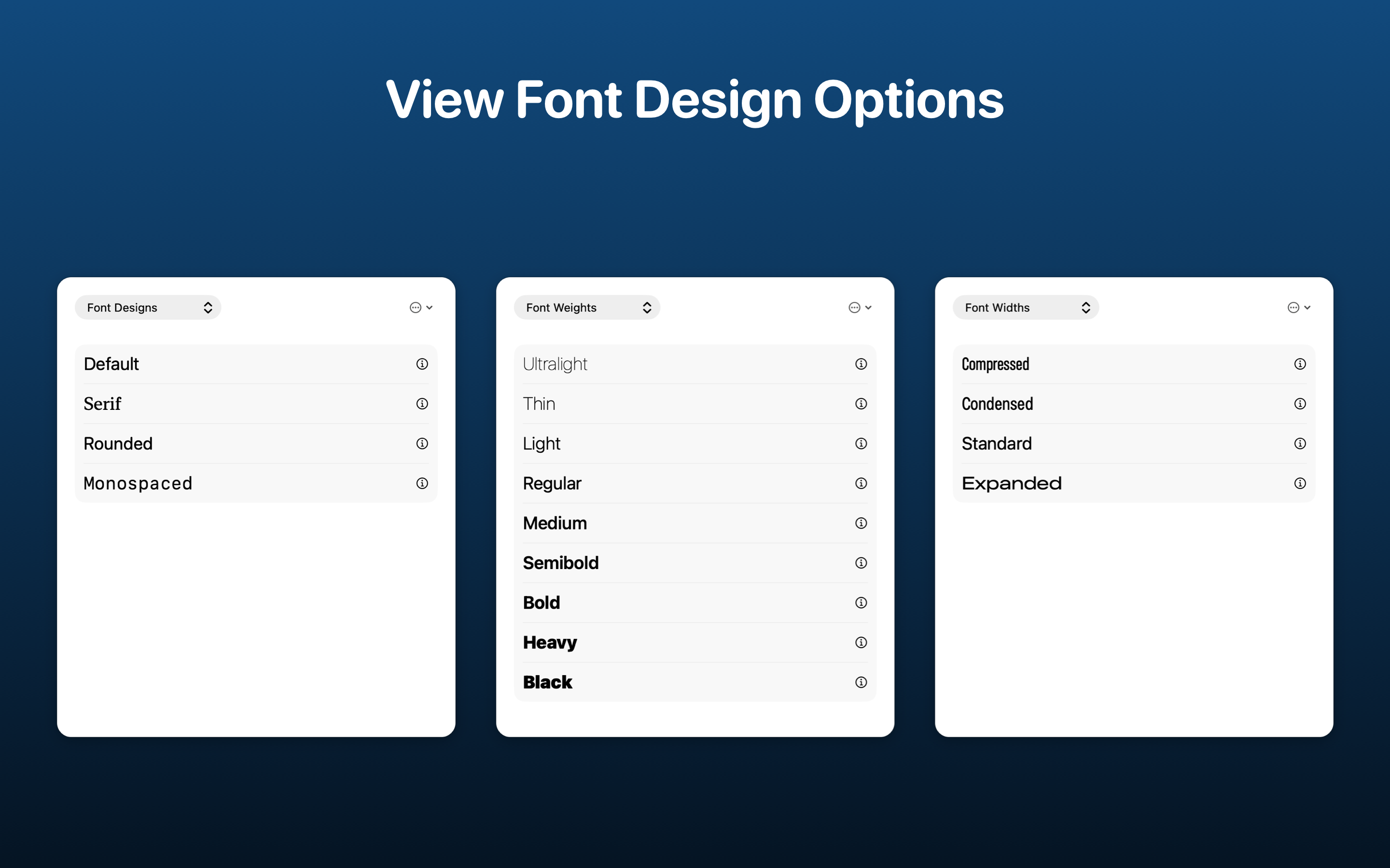
Preview how different font styles will appear. You can view Default, Serif, Rounded and Monospaced.
See how each font weight looks on the scale from Ultralight all the way up to Black.
View all the different font widths - Compressed, Condensed, Standard and Expanded.
StyleGuide has been built using SwiftUI and App Intents.